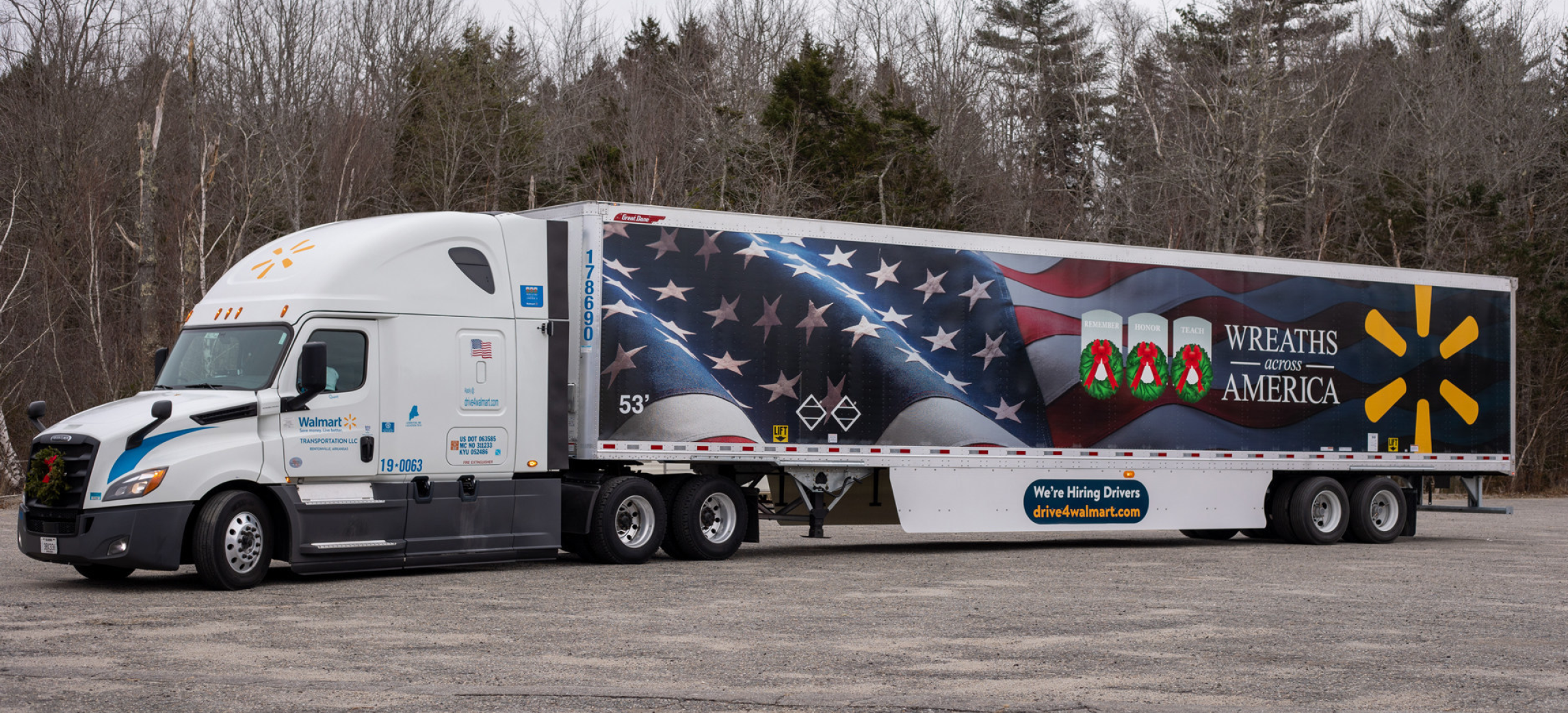

Wreaths Across America Trailers
It was truly an honor to work on the new semi trailer graphics for Walmart in partnership with Wreaths Across America. These trailers weren’t just vehicles — they became moving tributes, delivering wreaths that would be placed in remembrance of veterans across the country. Knowing that some of the trailers were featured in Arlington National Cemetery made the project even more meaningful. It added a profound sense of responsibility to the design process, as the visuals needed to reflect the dignity, gratitude, and reverence that the mission represents.
One of the neatest elements of the design was the folded American flag featured prominently on the trailer. This flag wasn’t just a symbol — it was the actual flag hooring a close friend’s grandfather. Incorporating something personal into a national tribute brought an entirely new depth to the work. It served as a reminder that behind every wreath, every headstone, and every mile those trailers traveled, there is a real story and a real family.
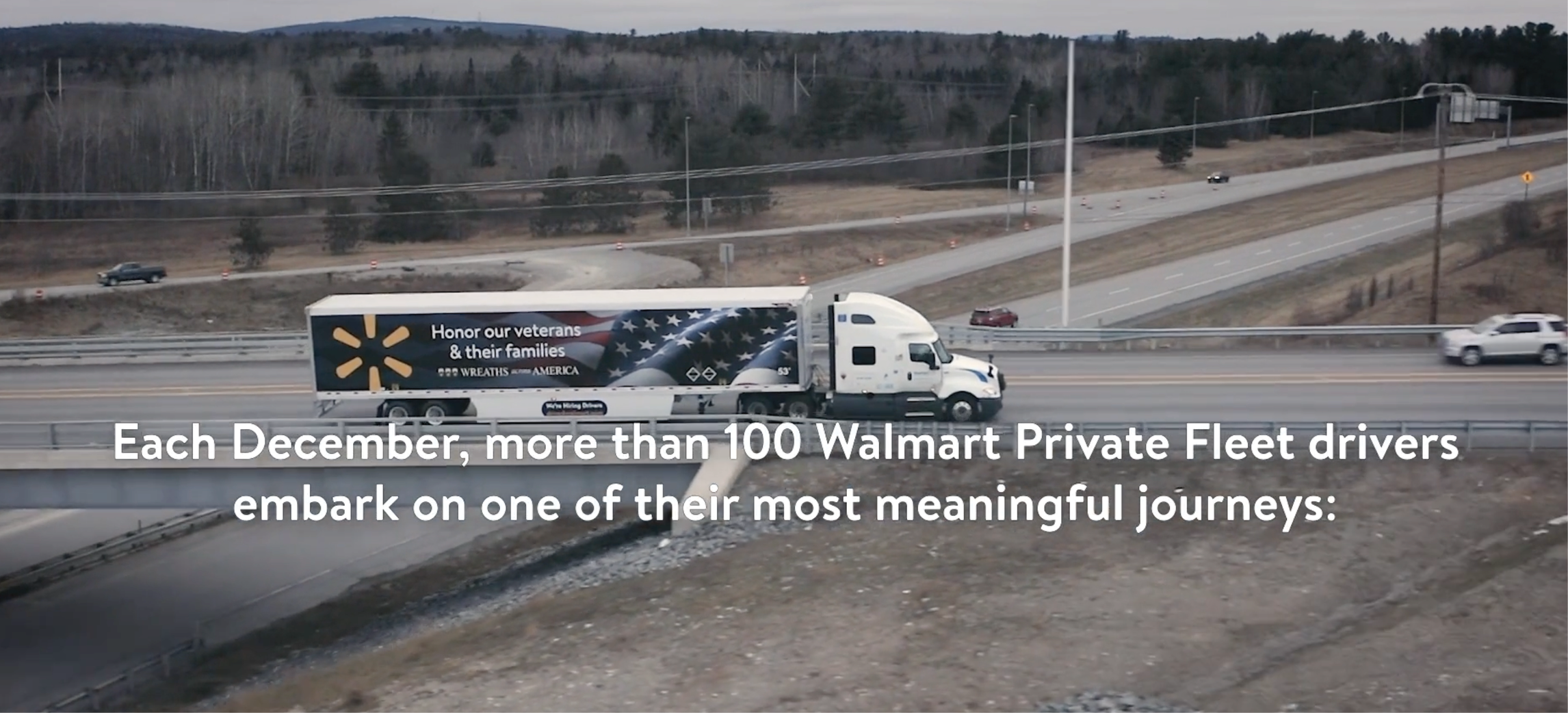
Every time I spot one of these trailers on the road, it’s a real treat. It’s a proud moment to see something you helped create carrying a message of honor and remembrance across the country.