2 Icons United
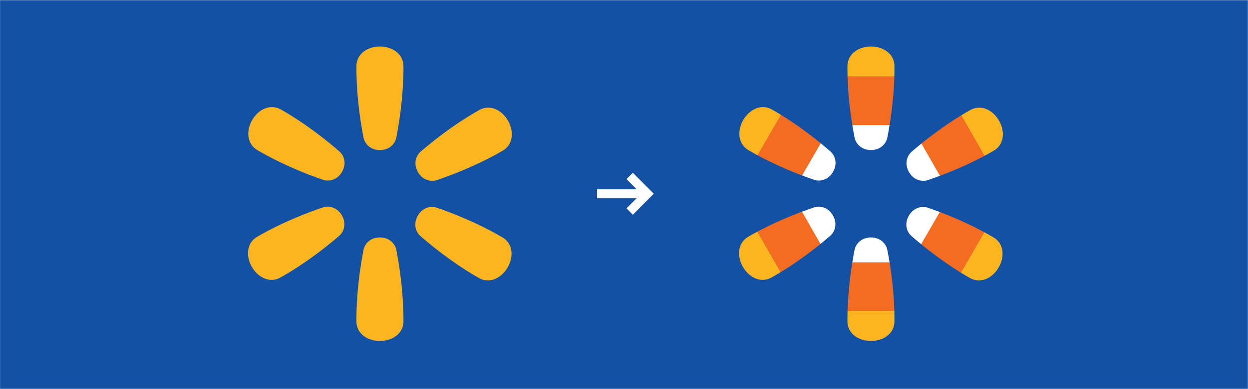
One of the most fun seasonal projects I worked on was reimagining the Walmart Spark with a Halloween twist—blending it with iconic candy corn. The goal was to create a simple, playful logo that felt festive without losing brand clarity. By incorporating the classic candy corn color gradient—yellow, orange, and white—into the Spark shape, we were able to create something that was both unmistakably Walmart and unmistakably Halloween. The result was clean, bold, and highly adaptable across formats.
What made the project especially rewarding was seeing how far the concept traveled. The logo was rolled out across app icons, sample bags, in-store signage, web assets and more—proving the strength of a simple, well-executed idea. It maintained legibility at small digital sizes while still having enough personality to stand out in larger physical applications. It was a great example of how thoughtful brand play can create seasonal excitement while staying true to core visual identity.